
FENCES B/ORDERS WALLS - Keep Clear 2018 Catalogue, Review and Essay's
|
FENCES B/ORDERS WALLS – Keep Clear
|
…while every wall fails to accomplish what it was erected to achieve – the walls are never solutions – each wall succeeds at something else. Some walls define Us from Them with medieval clarity. Some walls encourage fear or feed hate. And every wall inspires its own subversion, either by the infiltrators, who dare to go over, under, or around them, or by the artists who transform them. [1]
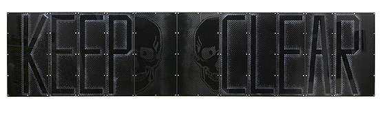
“We consider the border not to be a purely physical barrier separating nation states, but a complex continuum stretching offshore and onshore, including the overseas, maritime, physical border and domestic dimensions of the border.”[2] The painting/installation, FENCES B/ORDERS WALLS – Keep Clear, (2018), is the most recent of three ‘fences’ I have constructed. The first, FENCES B/ORDERS WALLS, opened at TCB Art Inc., in Melbourne in 2016. In 2017, The Yellow Brick Wall was installed in The Back Room at Kim’s Corner Food, Chicago, USA. As with the two earlier works, FENCES B/ORDERS WALLS – Keep Clear, offers a further symbolic image for a tangible ‘border style’ wall. My aim for each of these works has been to conjure something of the ‘sensation’ of confronting the real thing – “the brutality of fact”. “The brutality of fact” is Francis Bacon’s phrase for what he was looking for in his paintings. By “facts” he doesn’t mean to make a copy of the subject…but rather to create a sensible form that will translate directly to your nervous system the same sensation as the subject.[3] FENCES B/ORDERS WALLS – Keep Clear, presented at the Canberra Contemporary Art Space, combines the original FENCES B/ORDERS WALLS (2016) installation, with a new section positioned at the heart of it. Similar to a road sign billboard, the text ‘KEEP CLEAR’ appears. A ‘split skull’ image takes up position between the two words. In contrast to the formal and material characteristics of the original FENCE, the text and image of this new central section is inscribed onto a black, highly reflective surface. With its mirror-like quality, the sign presents the illusion of a potential rupture, a ‘space’, capturing the image of the audience as it merges with the work’s central narrative. In this way the illusion of an imaginable space directly challenges the visual illusion of impenetrability created by the flanking FENCE sections as they stretch out to the left and right of it. Much that influences my work is found in the visual vernacular of the streets and highways that animate the dense urban environment in which I live and work. Inspiration often arrives where walls and spaces imaginatively intersect with influences from intangible forces and the textured terrain of a tangible world. Fences B/orders Walls – Keep Clear draws on the qualities of various types of signage and temporary constructions of timber hoardings and other types of safety and security fences built around construction sites. They are a common type of street architecture I regularly encounter on my travels. Fitted with “anti-climbing devices” which claim to provide an “air-tight” perimeter, these fences, are most commonly painted black. In pristine condition they provoke urges towards ‘active intervention’. Over time they gradually accumulate graffiti and advertising posters. Despite the plain, matter-of-fact purpose and diversity of barriers to be encountered in the landscape, their fortress-like impenetrability constantly reminds me, metaphorically, of other types of constructed façades we also regularly encounter: the smokescreen, the cover-up, censorship and the muting of political opposition. A silence ‘erected’ for what it might hide as for what it might stop. The grid screen has long been a reoccurring character in my practice. For the first FENCES B/ORDERS WALLS work (2016), I turned it 45 degrees to make it appear like a cyclone wire fence. Analogous to the structural architecture of that universally recognized barrier, the text itself forms the physical ‘anatomy’ of the work - the bones of it. The legible spelling of the word FENCE appears, and is then ‘flipped’ into reverse to form an alternating pattern along its extension. In this way the word, despite its deadpan posture, is written to suggest conflicting and contested realities, metaphorically trapping the audience on both sides of the fence simultaneously: inside and outside its confines. Depending on where you’re standing, (and/or your point of view), determines what might be interpreted within the enigmatic forms suggested within the shadowy shifts of light and shade that lie behind the mesh. Running corner to corner along the length of the gallery space, the work’s visual dynamic sets up a rhythmic density that distorts easy legibility, metaphorically constricting both accessibility and meaning. What I was attempting to conjure through its formal qualities was a sense of a palpably rigid and unyielding physicality; a hard-faced sign for the ‘end of the road’; passage denied. In FENCES B/ORDERS WALLS – Keep Clear, (2018), as her vantage point shifts, the viewer acquires a more performative and significant role in the way the essential subject of the work is experienced. In the highly reflective panels of the KEEP CLEAR sign the viewer is drawn in as active participant, becoming part of what she sees. Disturbingly we look at ourselves ‘looking’; the ‘screen’ looks back at us; a ‘lens’ of cyber surveillance - on ‘every move we make’. In contrast to the visually flattened, deadpan character of the word FENCE, the text, KEEP CLEAR, inscribed across the sign’s highly reflective surface, seems to shift, almost simultaneously, back and forth between solid form and open portal into another, shadowy world that lies behind. This sense of spatial ambiguity where that which appears open is also closed, is intensified by the duo phantom-like aspect of the memento mori images that appear between KEEP and CLEAR. Possibly emblematic of a sign for ‘double danger’, in the context of this work it appears as reference to the Roman god Janus. In classical Roman mythology Janus is the god of beginnings and transitions; of gates, doors, doorways, endings and time. He is a ‘two-faced’ god as he is usually depicted with two faces looking in opposite directions towards the future and to the past. Any optimism that might attach to Janus as a symbol of change and transition; of a progression from past to future, of one condition to another, of one vision to another, and of one universe to another, is belied here, by the stygian depths of the larger sign itself. The constant, shifting reflections across the figure’s surface renders it elusive, denying a clear reading. This is not a sign for optimism. The way is not lit. The god is ‘two-faced’. Janus appears and disappears as one’s vantage point shifts. A trick of the light. This is a negative space in all sense of the word, all tending towards the conditional, or beyond, to the totally obliterating.[4] Hollowed out and imbued with deeper meaning, the street sign becomes a digging site that allows us to reflect on broader national, social and political implications of language that are all around us, and therefore invisible…taken for granted, on the street. The words take on a deeper meaning which is troubling, to ‘keep and ‘clear’ separately and together, the first word is possessive, and the other de-possessive, keeping empty, a permanent terra nullius or tabula rasa of the mind. Forgetting. Making space for the future by forgetting the past. The words take a ubiquitous street sign and transform it into a symbol of national mentality.[5] As I left the show, I was pervaded by a sense of the fragile aching beauty of the everyday, the precarious nature and contingency of our lives and of the world around us. I thought about freedom, desire, intimacy, community and the value of our permeability to one another, which we must uphold. And I thought about how all of that seems increasingly at risk thanks to the borders, walls and checkpoints we insist on building around us.[6] [1] Marcello Di Cintio, Walls – Travels along the barricades, Soft Skull Press, Berkeley, CA 94710 2013 [2] Department of Home Affairs, ‘Australian Border Force: Who we are.' [3] Anne Carson, Float - Variations on the Right to Remain Silent, Jonathan Cape 2016 [4] David Hansen , Through a glass but even more darkly, Catalogue essay, Janenne Eaton Road to the Hills, 2014 [5] Georgina Criddle, reflections on Janenne Eaton’s FENCES B/ORDERS WALLS – Keep Clear 2018 [6] Joe Florencio, University of Exeter, on exiting an exhibition by Wolfgang Tillmans, 2005, The Conversation, 2017 - Janenne Eaton 2018
|

ARTS - Canberra Times 2 October 2018
"Meanings subversive in dark works"
by Sasha Grishin
"Meanings subversive in dark works"
by Sasha Grishin
Janenne Eaton is a Melbourne-based artist who in her work inhabits the domain that lies between that which can be seen with the eye and that which is comprehended by the mind. It is like when you see a road sign but, in your mind, you somehow misread it, or associate it with something else, and something unexpected emerges that carries with it scars of the original visual catalyst. It becomes like a cerebral afterimage that remains with you long after the original stimulus has vanished.
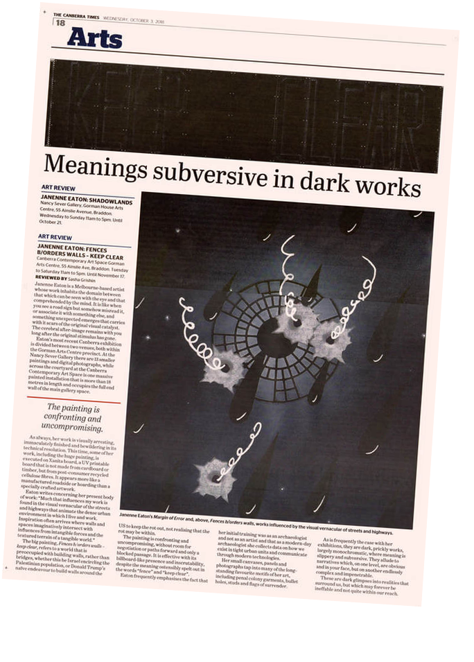
Eaton’s most recent Canberra exhibition is divided between two venues, both within the Gorman Arts Centre precinct. At the Nancy Sever Gallery there are 13 smaller paintings and digital photographs, while across the courtyard at the Canberra Contemporary Art Space is one massive painted installation that is more than 18 metres in length and occupies the full end wall of the main gallery space.
As always, her work is visually arresting, immaculately finished and bewildering in its technical resolution. This time, some of her work, including the huge painting, is executed on Xanita board, a UV printable board that is not made from cardboard or timber, but from post-consumer recycled cellulose fibres. It appears more like a manufactured roadside or hording, than a specially crafted artwork.
Eaton writes concerning her present body of work: “Much that influences my work is found in the visual vernacular of the streets and highways that animate the dense urban environment in which I live and work. Inspiration often arrives where walls and spaces imaginatively intersect with influences from intangible forces and the textured terrain of a tangible world.”
The big painting, Fences b/orders walls – keep clear, refers to a world that is preoccupied with building walls, rather than bridges, whether this be Israel encircling the Palestinian population, or Donald Trump’s naive endeavour to build walls around the US to keep the rot out, not realising that the rot may be within.
The painting is confronting and uncompromising, without room for negotiation or paths forward and only a blocked passage. It is effective with its billboard-like presence and inscrutability, despite the meaning ostensibly spelt out in the words “fence” and “keep clear”.
Eaton frequently emphasises the fact that her initial training was as an archaeologist and not as an artist and that as a modern-day archaeologist she collects data on how we exist in tight urban units and communicate through modern technologies.
Her small canvases, panels and photographs tap into many of the long-standing favourite motifs of her art, including penal colony garments, bullet holes, studs and flags of surrender.
As is frequently the case with her exhibitions, they are dark, prickly works, largely monochromatic, where meaning is slippery and subversive. They allude to narratives which, on one level, are obvious and in your face, but on another endlessly complex and impenetrable.
These are dark glimpses into realities that surround us, but which may forever be ineffable and not quite within our reach.
ber 21.
|
|